Supratech X – Branding

Engineering Innovation into a Future-Ready Brand

Supratech X branding is a testament to the power of design in industrial innovation. At Arobuz, we partnered with Supratech X to build a premium industrial brand from the ground up—combining visual identity, storytelling, and strategic positioning to reflect their technological edge and market leadership.

The Challenge

Despite strong technical capabilities, Supratech X faced typical industry roadblocks:

  • Their existing brand lacked emotional recall and visual sophistication.

  • Their target audience—engineers, procurement teams, and decision-makers—couldn’t differentiate them from commodity players.

  • Their touchpoints (presentations, website, proposals, etc.) didn’t reflect the premium pricing and value they deliver.

They needed a brand strategy that matched their vision for category leadership.

Our Strategy

At Supratech X, branding wasn’t just a design exercise—it was a strategic opportunity to express who we are and what we stand for.

We began by diving deep into Supratech’s identity through stakeholder interviews, competitive audits, and customer persona mapping. The insight that shaped everything?

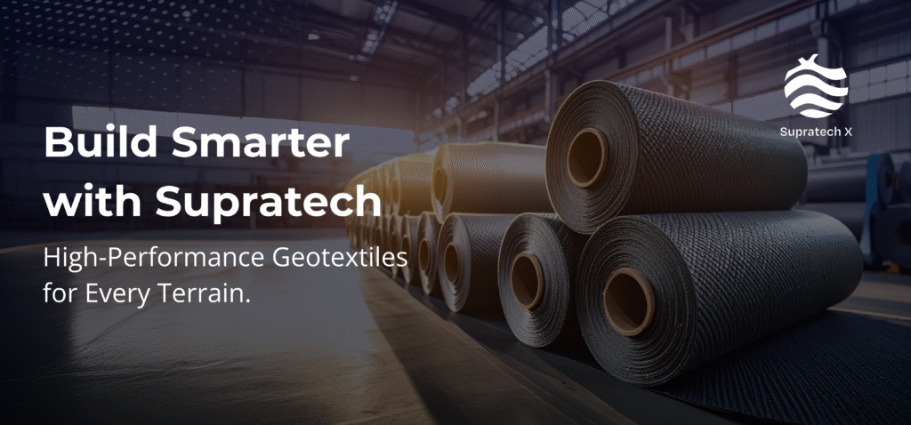
Supratech X doesn’t just test and innovate—they build trust at the intersection of technology and terrain.

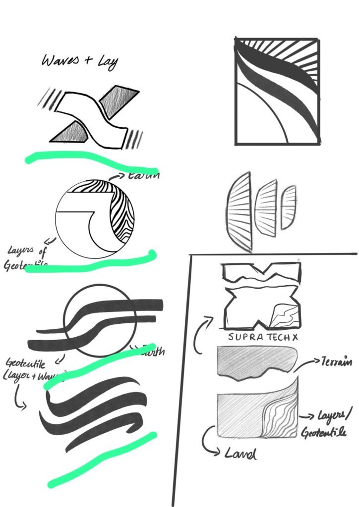
“X and Earth”: The Brand Philosophy

At the heart of Supratech is a powerful metaphor:

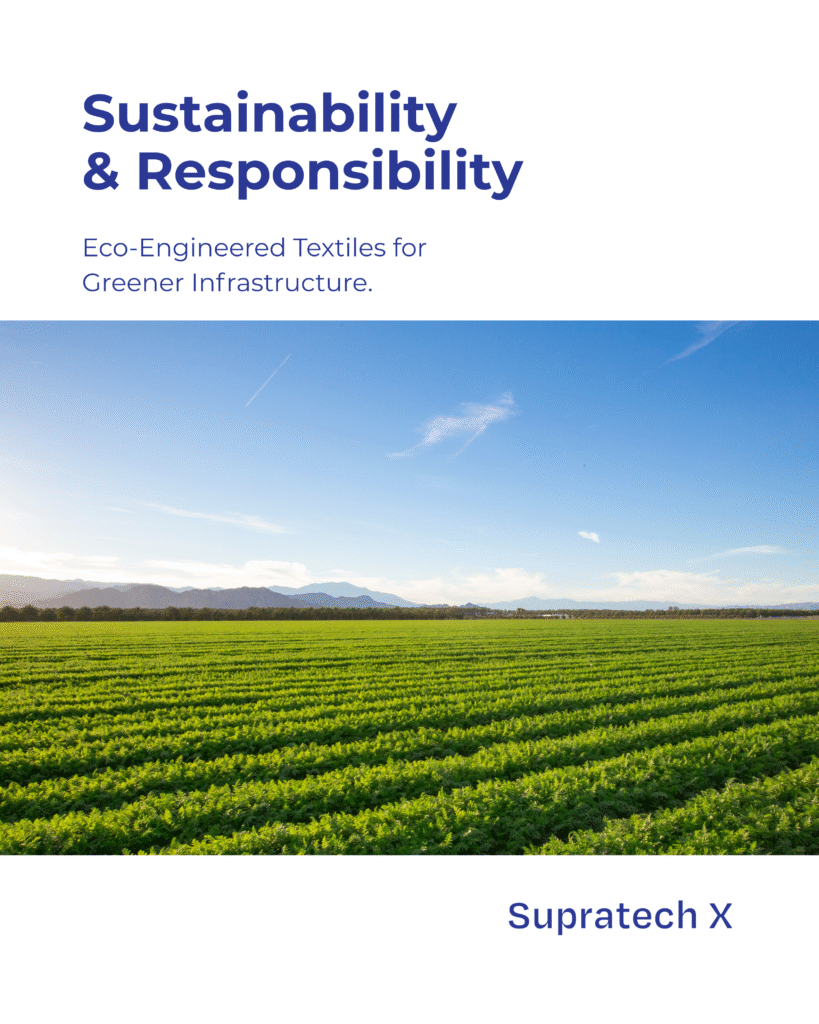
“X and Earth” — where engineering excellence meets environmental responsibility.

  • “X” represents precision, performance, and problem-solving through advanced geotextile innovations.

  • “Earth” symbolizes the landscapes we protect, the communities we serve, and the ecosystems we strengthen.

This idea became the North Star for a refreshed brand that’s not only technically superior—but meaningfully grounded.

The Brand System We Built:
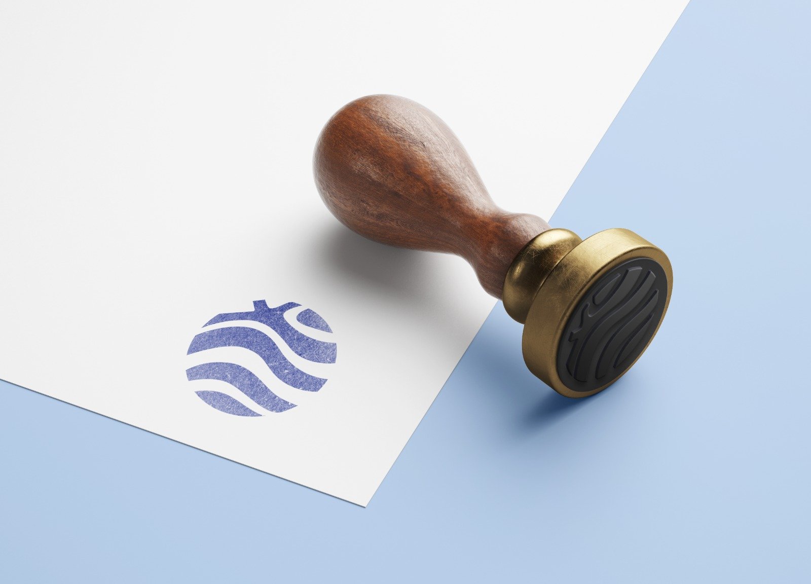
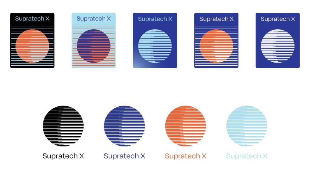
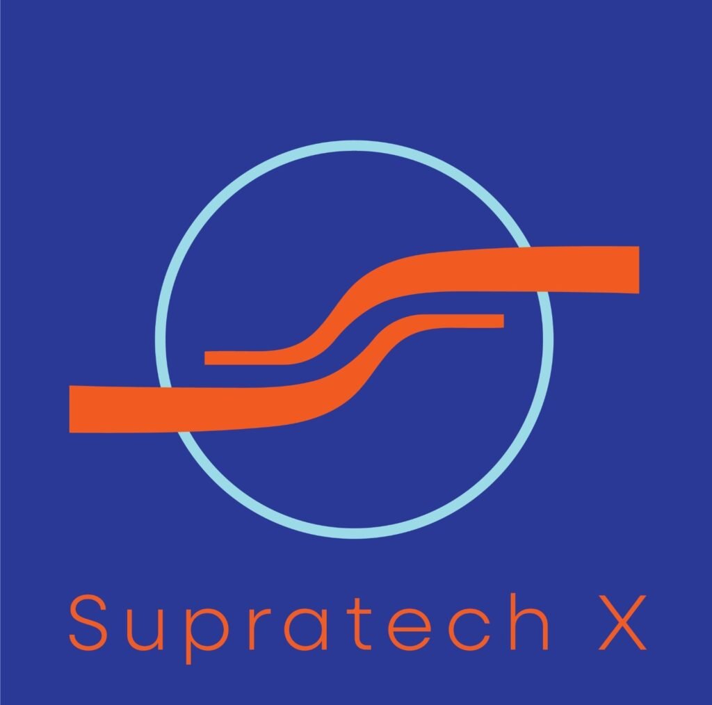
Logo Design: A clean, technical logomark that visually expresses motion, measurement, and trust.

Typography: Industrial-inspired fonts with modern clarity—communicating strength and sophistication.

Color Palette: Earthy grays with vibrant cobalt blue and safety yellow—conveying engineering expertise rooted in the real world.

Brand Language: Confident yet human, balancing data-backed authority with an empathetic tone.

Brand Manual: A robust 50-page guideline that ensures brand consistency across every medium and touchpoint.

Together, these elements helped position Supratech X as more than an industrial brand—it became a vision-driven force for sustainable progress.

Whether reinforcing roads, safeguarding coastlines, or transforming farmlands—Supratech’s geotextiles now represent a future where innovation supports the Earth, not just infrastructure.

The Solution

We began with an in-depth brand workshop, immersing ourselves in the world of manufacturing precision, technology, and leadership. From there, we built a powerful brand foundation that included:

  • A bold name with tech energy

    The ‘X’ in Supratech X became more than a letter—it symbolized exploration, exponential growth, and excellence.

  • A modern visual identity

    Inspired by clean geometries and industrial precision, we crafted a logo system that is scalable, versatile, and futuristic—yet grounded in trust.

  • Color & Typography

    Strong monochromes paired with intelligent accent hues to reflect engineering clarity and tech agility.

  • Narrative & Voice

    We positioned Supratech X as a catalyst for innovation—“Engineering Ideas into Impact”—with messaging that resonated across industries, from automation and aerospace to medtech and manufacturing.

  • A full-fledged brand manual

    Equipping the Supratech X team with usage guidelines, tone of voice, templates, and scalable brand architecture.

For SupraTech X, we put together a robust digital strategy that includes: